


The Ukrainian chapter of the global anti-corruption network Transparency International developed an interactive infographics, which presents the results of the Transparency Ranking of 100 Ukrainian Cities. You can check this infographics at https://transparentcities.in.ua/ranking/. This way, the Building Transparency in Ukrainian Cities project team demonstrates the data on accountability of the authorities and the availability of public information in the cities in a clear and user-friendly manner. Now, with the help of the infographics, it is possible to evaluate the state of transparency and accountability in the 100 biggest Ukrainian cities, as well as easily compare the cities and evaluate the state of development of certain areas across the whole country.
Infographics provides an opportunity to analyze the general state of transparency in Ukraine based on any chosen sphere, using the index map. .
In order to explore a chosen area in detail; you have to pick 1 out of the 13 display parameters. The map, filtered according to this parameter, will display a corresponding palette: from red, which indicates a low level of transparency in this area, to bright green. At the general index map all cities are displayed simultaneously. While hovering a cursor over one of the cities, the current evaluation of the sphere in a particular city will pop up.
In addition, the infographics provides an opportunity to compare cities. This allows to find examples and directions of development. In order to compare two cities, you need to choose them in the pop-up window or click on the names of the corresponding cities under their graphs. The names of the cities will be indicated with the corresponding colors.
In the selected graph, each axis corresponds to a certain value of the indicator in a specific area, which is written in a black font. Green points at the axis correspond to the value the city indicators, if you hover the cursor over it, the exact value of the indicator will be displayed in percent. The more distant the point from the center is the better is the indicator of the chosen city. Thanks to this tool, it is possible to compare all cities, to identify patterns, or to find already existing successful practices.
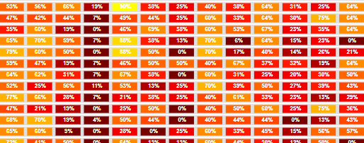
We would like to draw particular attention to the Initial Data section. The ranking of 100 cities across all 13 spheres is displayed in the form of a spreadsheet. It contains all the data that were collected during the study. The color of the cells of the spreadsheet from red to green corresponds to the value of the current indicator – from lowest to highest. The results of cities are listed in the spreadsheet in percent value. It is in this spreadsheet that you can find out, for example, by which indicator Korosten, which ranked 33rd, turned out to be better than all the other 99 cities. Or else, in what area Brovary may give an advice to Lviv, and Oleksandriiaa to Kyiv.
The project is implemented by Transparency International Ukraine with the support of the UN Democracy Fund (UNDEF). Project partners are Transparency International Slovakia and Institute of Political Education.


